
And truly an avoidable one, at that.
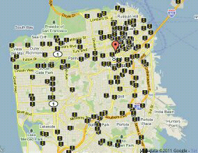
National advocacy group Transportation for America has released its latest Dangerous by Design report, and with it an interactive map of pedestrian fatalities in the last 10 years. Just type in an address to see the shocking list of places where someone has been killed while walking in the last decade.
Each black marker on this map represents a person, someone whose life was deemed to be just the cost keeping traffic moving in this city. Whenever a pedestrian safety improvement isn't built because the cost of construction is too high, I'll remember this map. What's the price of a bulb-out or countdown timer compared to the life of the person it saves?


No comments:
Post a Comment